Monday 27 December 2010

Wooden computers


One day, when I'm no longer flat broke, I'm going to replace my 2006 MacBook with a mini desktop (like a Mac mini), a mobile projector and some low-profile alternative to a keyboard - I say an Arduino LilyPad-based homebrew dataglove, but I'm told that the technology for webcam image recognition is so advanced now that visual gesture recognition is much more efficient than conductive fabric and an accelerometer. We shall see. In the meantime, I'm going to fantasise about a mini desktop that is light, portable, and actually looks like something you want to pick up and touch and take to bed at night for an evening of Battlestar Galactica on the ceiling. Enter the glorious google search for wooden computer enclosures. Not all of the examples I found below are small enough for my liking, and none of them are affordable - some aren't for sale - but oh my, imagine the warmth schnuggliness of a living room with one of these as its media center.


The original show and tell for this DIY modern danish computer enclosure is now long gone, but isn't it pretty? It's far bigger than what I'm looking for, but if you're going to have a massive computer tower it really better had be an item of furniture in its own right.


This mod, entitled level eleven, is pretty much exactly the size and style I've been dreaming of. The only thing I would change is get rid of the speed stripe, and make the overall shape a bit more curvy, as at the moment it looks like something that should be sat on a desk whereas I want something that looks grabbable and maybe even cuddle-able.


This beast is far too large, but so beautifully ornate and art-deco that it makes me want to charge around shouting, 'I'm a time-lord, biyatch' - something Doctor Who will, admittedly, probably never say.


And finally, yes oh my god yes that really is a computer. But they only made 10 of them. No, it doesn't look grabbable or small. But if I had one I would bow down before it every morning and bestow upon it fragrant oils, precious jewels and sprinkle gold powders. Just imagine the patina.

Friday 3 December 2010

I had a dream last night about men


I had a dream last night about men breaking my best teacup. One by one they came into my kitchen and each did a little bit more damage until it was completely broken. I woke up really worried about my teacup, kind of wanted to give it a cuddle. I guess Freud would have a field day with that one. Why is my subconscious so Butler-esque and whiny?

Pictured: not my cup, but one in the V&A collection - see here

Saturday 6 November 2010

Weird pride

Today the brilliant Mark Nicholls wrote:
Who are those strange people who sit in parked cars at two o’clock in the afternoon staring into space? Why do they gawk at me when I walk down the street rambling to myself, trying to prepare the necessary phrases to use in basic human interaction?

Case in point. On Tuesday, I walked up the leafy suburb to cash a cheque. As I walked, muttering ‘can I cash this please’ or ‘could I cash this please’ or ‘could this be cashed, please’ I saw at least THREE passengers staring out at me. Who are they waiting for? Are they sitting there hoping someone might climb into the driver’s seat and drive them? Why do they always see me when I’m trying to be privately weird?

Let me tell you, being weird in this climate of prudence and common sense is not easy. Sometimes I want to sing along to pop songs packed into buses tight with silence. Sometimes I want to debate with myself the tone of voice someone used when speaking to me, and the implications of this tone on our relations. The only thing stopping me is the thin line between sanity and craziness, a line I am happy to straddle without medication.


Recently my housemates and I were teasing each other about our geeky inadequacies when it comes to social skills. Some of us took the Autism Spectrum Test on Facebook, because we like being given numbers to help us understand ourselves. I came out at 31, one point below the level at which doctors start looking at you funny, but a high enough number to make one of my housemates eyes swell up with surprise. Admittedly, this housemate has an unusually elastic face, so I probably overestimated the extent to which he was surprised.

When I was younger, I would spend every lunchtime sitting in the library quietly reading things in or about foreign languages, but then I realised at some point that the reason I had so few people to talk to was because I didn't go up to people and talk to them. Now I spend every lunchtime talking to someone so that I can be sure that I develop relationships with people. Relationships are important to me, not just because I need the company but because I find people fascinating - I love it when you're close to someone and you know some of the unique patterns in their head, and I love it when I say the right thing at the right time and it makes someone happy.

I'm really not good at chit chat. I don't like it at all. If there's something on my mind, then that tends to be the answer I give when asked, 'How's it going?' Here's a typical conversation:

Norm: Hi Zoya, how's it going?
Zoya: Great, I'm having a really nice morning. I just saw some children singing, holding hands in a circle, with two of them in the middle spinning around, and I thought what an idyllic image, and I loved the order and regularity of the circle with the rotation in the centre.
Norm: Oh. That's nice...
Zoya: (remembers that pleasantries should be reciprocated) How are you?
Norm: Fine, thanks. A bit tired.

I'm not even going to start on my outright refusal to recognise taboos. I spend a lot of my time getting into conversations about sex and death. Sometimes I even get people to talk about the class system.

I'm not really interested in looking at this stuff as though it were an indication of some sort of minor learning difficulty. I think it's nice to be weird. You can say things to people that they've never heard before, and that can bring up all sorts of positive feelings in them. This is why I don't walk down the street practicing necessary phrases. I quite like the way I bumble through them - many transactions for me begin with, 'I need to do Y. In order to achieve this I need to do X. I have this piece of paper which I am told can help you to help me to do X. Is this right? What do I need to do now?'

I can sort of sense that there are normal people in this world, but I tend to attract the weird ones so that we can analyse the shapes and patterns of life and talk about the stuff we're really thinking and feeling rather than the stuff we're supposed to think and feel. I think we're all having a great time together here in the weird faction.

Monday 25 October 2010

Design / D.E.S.I.G.N.

No blog entries for a while, because I started studying History of Design. Here's a video I took of my brain after 4 weeks of study at the RCA:

Sunday 26 September 2010

Shiny cyborgs

I really like to daydream about cyborgs. I plot out stories about them, imagining what will happen if cybernetic modification is taken on by a whole community, as a preposterous but stylish solution to the challenges that face developed economies and postmodern societies. I love to try and to figure out what my imaginary cyborgs should look like.

Obviously, cyborgs would kick ass, and few imaginary future societies kick as much ass as the Borg. However, the Borg are problematic. Firstly, they are basically communists. Secondly, they are evil outsiders with whom the imagined viewer of Star Trek is not supposed to have any sympathy. My cyborgs are individualistic, libertarian capitalists with an entrepreneurial streak, and as the protagonists of the plot I'm imagining, are not evil so much as foolish but well-intentioned, and kind of afraid of dying. Not really Borg-like at all.

Also, the Borg look unfinished - many wires and circuits are left exposed. This is probably because they don't have to use product design to communicate with people, because all they do is assimilate and destroy. In a market-driven world, cyborgs have to look friendly. For example, let's say it's the future, and you want stronger legs, because you're now 80 years old and you're not as fit as you used to be, or because you're one of the few people left in the world who is under 60 and your job is to carry 90-year olds around a care home. Maybe you'd want your mechanical leg-enhancers to look like this:

This product already exists. As reported by the Economist, the designer, Yoshiyuki Sankai, is having trouble getting his government to accept its use in hospitals, because they are still unsure about its safety.

White is the colour of the future, the colour of wishes and possibilities, the colour of new frontiers. Which is all very nice, but new frontiers are risky. They might be full of aliens who want to kill you, or assimilate you into their murderous hive. New technologies such as stronger legs are safer in that they protect you from occupational hazards. But like a cutting-edge, unsinkable ship crashing into an iceberg, an unexpected obstacle could be disastrous when you're carrying pensioners.

So I haven't settled on an answer yet to the question, 'what do cyborgs look like?' How do you make modifications to the human body look safe? Apparently not by making them shiny and white.

Saturday 25 September 2010

Few and Far


Today I went to a design shop called Few and Far, which was hosting an exhibition of handcrafted wooden chairs and tables. Near the door they had a pile of blank white papers and a net hanging from the ceiling. Visitors were asked to write their wishes on the blank page, fold it into a plane and make it fly into the net. I wished for hypoallergenic kittens.

Paul Cocksedge: a gust of wind


Last night I was at the V&A museum, at an amazing, completely free event with music, art installations, lectures and all sorts of fun things. I walked away with a limited edition work of design art, and my taking it home with me was part of the art installation. I can't wait to see what is in store at next month's friday late event.

The thing I went home with was one of the 'bits of paper' that made up Paul Cocksedge's installation, 'A gust of wind.' 300 pieces of Corian, moulded into the shape of curved papers blown by the wind, were hung from the ceiling to look like a moment frozen in time: a moment of graceful flight, or alternatively a moment of chaotic disaster as your cherished work is blown away from you. At the end of the evening, each piece was given to a visitor to use as an tray for unfiled, 'wandering' papers to gather. They are imprinted with the words, 'ideas tray,' so it's also a place where wandering ideas that might have become lost can be kept safe. Perhaps so that possibilities can be captured and processed into creative work. Although the trays are a way of collecting scattered things, they are themselves scattered pieces of what was once an art installation, as their curvaceous, asymmetrical form reminds you.

The future that never was


Photographer Mariela Paz Izurieta
A while ago, during a very inspiring day in which I finished painting my furniture (except for one little square that I forgot) and met a friend who I hadn't seen in years, I picked up a copy of a new magazine called Oh Comely. I'm not usually attracted to magazines, but this one had a huge amount of white space on the cover, some grey cursive handwriting and a little portrait photograph of an artist on the cover, so I thought it looked promising. Sure enough, it turned out to be like a lifestyle magazine for cheapskate dreamer types like myself, with an article on balancing the need to make money with the need to pursue your creative projects, another on a chinese dance group who try to embody calligraphic designs, and one in which illustrators were asked to draw something about loss. 'Loss' took on a range of meanings, from the disintegration of personality and cognition in Alzheimer's sufferers, to imaginary curator-elves who collect all the objects that the illustrator loses in her lifetime.

I felt like all three of these articles took on an extra layer of meaning simply by virtue of being printed with such wide margins of white space. The first one is a bit obvious I suppose - that sense of spaciousness that you have to cultivate in order to balance a busy life and still feel emotionally fulfilled, illustrated very well by a gorgeous accompanying photograph of a girl relaxing on a couch. The second two were connected for me. I'm not a calligraphy expert by any means, but I feel like when you're faced with a blank page, brush in hand, the white space almost vibrates with possibility. My eye picks out among the imperfections in the paper the impressions of strokes that could have been painted. Actually drawing a character on the page brutally closes down infinite possibilities, but even after the character is finished, the fact that the white space doesn't disappear makes the piece more alive and real, because the memory of a future that never was haunts it.

The chinese dance group draw a similarity between calligraphic characters and human characters. Although a character is static and inanimate, a well-drawn character appears fluid and dynamic, as though the smooth, breathless movements of the calligrapher were being repeated each time someone's eye passes over the result. It is the impression left behind by the painting process, a process that continues as reading. In the same way, although a personality is a dynamic process, a movement of thoughts and feelings that pass so quickly that most of them are disregarded and unrecognised, society forces us to take on an identity, to give an impression left by our mental processes and our behaviours. A chinese character can be drawn in countless different ways, and the same goes for our social identities. Yet we have to give some consistency, other wise we, like calligraphy, are illegible. But like white space behind black ink, all of the things we haven't said, all of the people we could have been and all of the things we chose not to do, haunt our memory and vibrate with possibility.

The fulfillment will be ours


'...And we made our way sadly round the showcases, ashamed of our impotence. Every epoch had its own style, and ours alone should be denied one? By style people meant ornamentation. But I said, "Do not weep. Do you not see the greatness of our age resides in our very inability to create new ornament? We have gone beyond ornament, we have achieved plain, undecorated simplicity. Behold, the time is at hand, fulfillment awaits us. Soon the streets of the cities will shine like white walls! Like Zion, the Holy City, Heaven's Capital. The fulfillment will be ours."' -Adolf Loos, Ornament and Crime, 1908

Saturday 18 September 2010

London room: furniture before and after

My room is getting close to completion now. Photos of the whole room will come when I'm finished mounting art on the walls and when I have a nice divan sheet (I know the perfect one is out there, so I'm still holding out). For now, here's before and after shots of the furniture!

My Mum found most of the furniture in a second-hand shop, except for the bookcase which was a hand-me-down from a family friend. In total the whole set cost £70, plus the cost of paints which I have lots and lots left over of. Unfortunately I still need to touch up the paint job in some places, but once that's done I'll get hold of a nice camera and take some really beautiful shots!

So here's the before:


First of all, the dressing table had a blotchy stain on it, so needed repainting anyway. Also, I'm really not into the antique-effect pine look. Finally, the cabinet was pretty revolting: with the random hovering cupboard and ill thought-out s-shaped transition from large lower section to small upper section, the tudor-effect window right next to the flowery panels and the fact that it was covered in knots and holes, it really needed some TLC.

Here's the after:


So, the first thing to get out of the way: the bookcase fits almost perfectly on top of the chest of drawers, so that seemed like an obvious decision. I promise that by the time I show photos of my room again I will not only use a better quality camera, I will also have reorganised these shelves so they look less messy! Never mind. One important point is that the bookcase and the mirror unit for the dressing table both have furniture pads underneath them to limit damage to my paint work. Definitely a necessity.

I was going to go for full-on 2009 colour of the year Pantone-style turquoise, but my Mum talked me down and had me go for this colour, which Dulux call 'inky pool.' She was completely right to do so - it's much more relaxing and looks particularly lush on the curvy legs of the dressing table and buffet. I went for a bright, snowy cream because glossy, pure white would look too cold against the turquoise, but a more yellowish shade of cream might have clashed with the walls. I'll write a post about what went right and what went wrong with my painting methods later on.

Aside from paint colours, I also had to choose a new fabric to recover the buffet. I didn't have a major problem with the yellow cover from before, but I absolutely love the reupholstery jobs featured on blogs like Design*Sponge that involve dramatic prints and I wanted to try my hand at something similar. In the end I didn't go for a print with contrasting colours, but I'm still very chuffed with this big, leafy design on soft, cream fabric that almost matches the paint.

Finally, the cabinet. I knocked out the small cupboard from the top and replaced it with glass shelves, which look much less fussy. In the process of getting rid of the cupboard some of the flowery panels were removed, but I've kept others because they actually look kind of sweet in cream. I knew all along that I was going to put that massive, red book in front of one of the s-curves, but I didn't know that the cabinet would fit so well in the corner of the room that the curtain would conceal the other curve - that was a massive stroke of luck. Finally, I put some little wicker baskets on top (they don't really show in the photo) to use more the height of the room for storage. Now the parts of my teapot collection that are not in daily use can sit proudly in the corner of my bedroom!

Thursday 9 September 2010

L'Ennui


A bumper crop of posts are coming soon. In the meanwhile here's a bit of strange 1am musing

I had just been reading Ennui by Sylvia Plath alongside her annotated page of the Great Gatsby (above) when an email from Groupon came into my inbox. I quickly learned that advertising is much more entertaining after a good dose of poetry. Try reading the following aloud in a dark room, in near-perfect RP with a strong drink in hand:

Drink, dine and dance
at the Best New Bar
of this year,
with an amazing selection

of blended beverages and tasty
nibbles. Enjoy the amazing
Chargrilled Beef Burger
with delicious handcut chips

or deep fried goats
cheese with cranberry
Not just another bar,
Aquum focuses on quality

and giving you
a fantastic individual
experience


Obviously Drink, dine and dance is about the way that materialism dehumanises us, strips us of our individuality and is the root cause of the paralysis experienced by young people faced with too many options to choose from.

This is what happens when you study humanities.

Sunday 22 August 2010

Bountiful harvest!


My Mum and I have been gathering plums in our garden. We have one big plum tree and one 'sucker' (that's the word my Mum uses, I'm not sure what she means). We gathered everything two short people could reach with a big pole, and left lots of high-hanging fruits for the birds. We couldn't believe it when we walked away with three full baskets!

Tuesday 17 August 2010

London Room: Bedsets I can't afford

Very soon I'll be moving into a bedroom in London to do my MA degree, so I'm planning how to decorate the room as beautifully as possible for as little money as possible. My Mum scored some amazingly cheap second-hand furniture for me, which I'll be blogging about as I repaint them. For now I'm thinking about colours and textiles as a nice kind of brain candy.

Right now I'm thinking about bedsets. While I'm not going to go for the cheapest option available, I still have a very tight budget. Sadly, as I look on the internet I find a huge variety of beautiful bedsets that fit the style and colour palette I have in mind perfectly that I simply cannot allow myself to spend the money on. To assuage the pain, I thought I'd dump a few of them here to feel like even if I don't own them, they're making their mark on my territory in some way.


The Seaside Savvy quilt by Le Attiser is $139, and is handcrafted using traditional block printing methods from the Thar Desert of Rajasthan in India. I'm happily jumping on the big turquoise bandwagon, but since my bed is next to the window I want it to be dressed in white to reflect the light into the room, so this pretty turqoise on white pattern is perfect.

Anthropologie's Crowned Crane bedding set would have also been perfect for me in that the origami folds would be a great contribution to the 'big, fluffy cloud' effect I'm hoping for. Unfortunately, the duvet alone is £148. Maybe in another life.

Devon seersucker bedlinen from the White Company is also a very tempting option for me, especially since now that it has 30% off it's almost within my budget at £42 for a duvet cover. I love love love seersucker, whenever I see it I want to reach out and touch it (this is sometimes awkward when it's in a man's shirt).

The Perch Pillow is of course only a pillow and not a full bedset, but I think the colouring and style suit me really well. Unfortunately it's $100 plus shipping, so I'm going to have to let this one fly away.

Monday 16 August 2010

5 lovelinesses in Israel

I'm about to leave Israel after spending most of my summer vacation here, mostly relaxing but also, as a stroke of luck, volunteering at the Design Museum I wrote a post about a while back. I'd like to make a habit of keeping track of the good things about a place, especially somewhere like Israel that is not entirely unjustifiably stereotyped as being a land full of crazy angry people yelling at each other all the time. So I thought I'd list some of the nice places where I've enjoyed sending my time. I've definitely forgotten something (and I've omitted a wonderful wedding I attended) but here's a quick rundown off the top of my head.

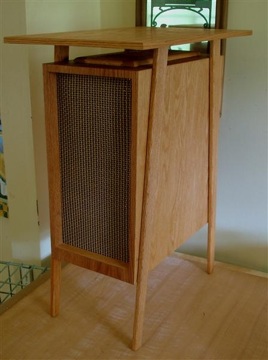
Jaffa Station Compound used to be a train station in the Ottoman era (apparently that's when the Turks had a lot of land, not when large swathes of the middle east were covered in plush fabric buffets). Recently it was renovated into a shopping and eating complex, and the beautiful old architecture has attracted some wonderful shops. My boyfriend's super sciency family were enthralled by the shop full of puzzles and toys, and I was incredibly delighted to find a charming antique shop full of old academic-looking doodads and vintage Eames and Le Corbusier chairs (one day I'll have great photos of it to show you as my boyfriend's ridiculously amazing photographer sister was there).


Tazza D'Oro coffee house in Neve Tsedek is a really cute, charming and homely coffee place with pretty good food. I've been there twice and the second time my boyfriend was disappointed with his meal, but I got the risotto balls and I ... dare I say it ... I had a ball. Ouch. Sorry about that one. Anyway, the Neve Tsedek neighborhood is really lovely, and is only going to get better the more it is renovated. It's such a breath of fresh air when you're in Tel Aviv to suddenly step out of the maze of high rises into an area full of eclectic stone buildings. It's sort of like stepping back into the real world after the virtual reality of bauhaus. Being from Yorkshire, I like a good trip to a scenic place to involve food or drink in some way, so Tazza D'oro made me very happy indeed.

Holon Design Museum is as nice as I was expecting it to be and more. I had a great time volunteering there, the gallery staff are almost all students of design so they have great insights about the exhibits, and the exhibits themselves are wonderful. The current exhibition, senseware, is a beautiful, futuristic white space filled with experimental designs using advanced artificial fibers. It gives you an image of a future where the personality and intimacy of craft is present in mass-manufactured goods through innovative use of charmingly tactile materials. Particularly amazing is the Fukitorimushi, which Engadget wrote about during the Milan incarnation of the exhibition. I want to take it home!

Mineral beach: the web link really doesn't do it justice. Every time I come to Israel I have to go to the Dead Sea. I love travelling through the cinematic scenery of the desert, and being able to just lie back and relax looking at the blue sky and golden hills. I've never been to another part of the Dead Sea but apparently Mineral Beach is pretty unique and something of a hidden treasure. I'm told that to experience the Dead Sea you usually have to lie in a separate, designated pool, because most of the sea is being used for mineral extraction. At Mineral Beach there is no sign of industry, and somehow it's always deeply quiet even though there are other people milling about. They also have massage and a hot sulphur pool, which makes it all the better.

Onami: I've been staying in an apartment in the centre of Tel Aviv, a stone's throw away from Haarba'a street, which is home to a large selection of extremely good restaurants. Of the ones I've tried, Onami is by far my favourite. Tel Aviv has a huge number of Japanese restaurants, but Onami is the only one that really tastes Japanese. On the sushi menu they have the usual nigiri and hosomaki and temaki, but also chirashizushi and inari, which are both delicious and homely dishes that seem to me to be unfairly overlooked by other restaurants who probably take their lead from the Californian model of Japanese food. Their miso soup is made with red miso paste, which is always a way to win my affection, and they serve kanpyo, which isn't always available elsewhere. Details like this make the place wonderful for vegetarians and fish eaters alike, and I've loved popping over there for midnight supper a couple of times.

More added to the blog roll

I'm a bit slow, and have only just found these amazing design blogs on the blogrolls of other design blogs I read. How many times do you think I can say blog in one blog post? Blog. Here's the links.

Desire to Inspire: Pretty photos of pretty homes.
Decor8: Shopping, window shopping and sometimes art.
The Brick House: Amazing modernistic home renovation
Style Files: Pretty photos again.

Blog.

Sunday 15 August 2010

Embee - Upside Down (Feat. Maia Hirasawa)


This video makes me so happy. I gotta get me some of those floating oranges for my room in London.

Thursday 5 August 2010

Oops.

After I complained that Hebrew writing is horrifyingly ugly, my computer has come back from repairs with a shiny new keyboard ... with Hebrew characters on it. Now I have to see them every day, in all their lumpy, awkward glory. The only possible explanation is the revenge of a wrathful omnipotent one who doesn't like His holy language to be insulted. Oops.

Tuesday 3 August 2010

Anticonsumerist Design

I just came across a graphic design company called Thought Bubble, whose goal is to use beautiful infographic design to contribute towards positive social change. Here's a great example of their work:


In ablog post about this video, Suz explains that part of her reason for featuring Micah White was her long-term admiration for Adbusters, a group who produce satirical billboard ads to make us rethink the lifestyle and self-image sold to us by advertising. Adbusters, she says, was her first piece of solid evidence that you can work in design without contributing to consumerism.

This makes me think of two things. First is a conversation I happened to be having last night, where I told an Israeli about the relatively complex identity politics at play in consumerism in Britain. He commented that I had a grin on my face as if I thought consumerism was a good thing. I said that on the contrary, I think it's horrifying, but I have a kind of odd admiration for it because of its immense power to manipulate people and destroy the planet. I compared it to the shared feelings regarding the military that my boyfriend and I had spoken about earlier that day - we are both vaguely pacifists, but we both get a deep sense of joy and awe from anything that reminds us of the army, be it tanks, guns, or chairs lined up in a regimented row like soldiers. Consumerism is a weapon of mass destruction, I said, but a weapon of mass destruction is impressive and even beautiful if you look at it from the point of view of an engineer.

Secondly, I haven't yet figured out when design became an elitist tool of the corporate hegemony. The designers of the Bauhaus movement used to talk about mass-production as a liberating technology that could deliver beautiful, quality, comfortable goods to the masses at a price they could afford. Henry Ford described mass production as making the cheapest goods possible for the highest wages possible. Yet somewhere along the line, beautifully designed, mass-produced objects became expensive, wages and working conditions became barbaric, and the meaning of clean, modernist design became a symbol of economic and cultural privilege. Adbusters and Thought Bubble are both groups that believe that aesthetically beautiful and on-trend design can and should be a force for good in the world, something that everybody benefits from. Aesthetics are after all not a base materialistic pleasure, but something spiritual that should connect us to others. I hope that similar groups will pop up in other fields of design as well.

Monday 2 August 2010

Halloumi

There's an entry on designer chairs coming soon, but I still have to source one of the photos so for now, a rant about halloumi cheese. Or more broadly, our traditional ways of naming food products is completely bent out of shape.

I love halloumi. As a vegetarian (who doesn't think about rennet very much), it makes a great meat substitute when preparing some middle eastern and mediterranean stew-type dishes, and it is of course wonderful instead of meat in a burger (a la Nandos). However, two bad experiences with unfamiliar Halloumi cultures have led me to be more wary of this delicious food than I would like to be.


Specifically, I like Halloumi because it doesn't melt, so you can fry it, and it tastes salty, so you can use it like chicken. When fried it has a caramelised crispy outer layer and a soft, melt-in-the-mouth inner core. I think many people would agree that this is Halloumi at its best.

It turns out that some people consider Halloumi to have some other place in the culinary world apart from satiating vegetarians. Example number one: I went to a gourmet cheese shop in Cambridge, bought their Halloumi, and got home to find it crumbly and smelly, rather than bouncy and salty. I was appalled, it ruined my meal, and as far as I am concerned anything that ruins a meal of mine is truly evil.


Example number two is photographed above. This Halloumi was bought in Israel, so it is perhaps surprising to learn that it has no chutzpah or sense of survival. Almost immediately upon impact with the pan it melted into a soupy, sticky mess, like any other cheese would. I simply cannot see the point in Halloumi if it's going to behave like all the other cheeses. It's not like the other cheeses, it's better than them, that's the point! What happened to you Halloumi, you used to be cool.

If the word, 'Halloumi,' doesn't actually always mean, 'bouncy in the mouth, solid in the pan,' then personally I need cheeses to be renamed to avoid confusion. I would happily buy, 'Bouncy solid' cheese and use it in the same way whether it is Halloumi or Paneer, I probably wouldn't buy, 'Salty melty' at all ever whether it was Halloumi or cheddar or whatever else, and if I did buy, 'Crumbly smelly,' I would know better than to put it in a tagine. Screw these fancy foreign names for foreign cheeses. I want them translated into a language I understand.

Androgynous chairs


While travelling around England I visited Chatsworth house, and spotted this new addition to the Cavendish family's collection. These 'Enignum' chairs by Joseph Walsh are so beautifully designed, even my traditionalist boyfriend loved them. The angling of the seat, the way the back supports your spine without pushing your shoulder blades forward, and the lovely suede textile make the chairs very comfortable as well. It has the masculine appearance of Panton's S chair viewed from the front, but the styling and materials are more organic, and the curvy cut-out in the centre (which boost the comfort on the spine by the way) give a feminine balance to the piece. This gives the chair some cuddly, chilled out yin-yang that makes me feel all happy and warm inside.

I delayed posting this for a while, but then I saw this chair's antithesis in Tel Aviv's Habitat and I had to point out the comparison. Check out this handsome fellow:


This is a De Sede chair, so it really shouldn't be ugly, but there you go, we all have our bad days. I'm sure it's just my personal opinion, but this bulky hunk of leather precariously balanced on a cantilever base looks like a rugby player in stilettos. Then again, I'm sure some people are into that. Here's De Sede's hilarious excuse for inflicting such a thing on the world:

Variety is ensured by this elegant chair-cum-armchair programme. Whether in attractive freestanding cantilever design or as a traditional chair with lacquered or natural wooden legs, the models in this programme imbue every room with an aura of distinction and represent the epitome of enduring worth.


In other words, it's a rugby player in stilettos who happens to also have a massive trust fund.

Thursday 15 July 2010

Whitby

Whitby is a little coastal town in North Yorkshire which I believe to be one of the most wonderful places in the world. It has the usual English seaside charms: a port with pretty little fishing boats and a sea, pretty little English terraces that snake up the hills in intimate little alleyways, and on top of that it has old abbey ruins. But Whitby doesn't stop there. It is one of only a few places in the world that has access to Jet, which is made into dramatic, elegant jewelry and sold in lovely little shops in the narrow winding streets. It also has goth and folk festivals which attract a lively and interesting crowd of people. Its pubs are cosy and authentic, its shops are unusual and even the kitschy horror attractions don't tar its beauty.

But you probably knew all that. Here I'm going to share a few things that I found in Whitby during my last visit that I wasn't aware of before.


(Image (c) English Heritage, nabbed off their website)

Miniature shop of miniatures
There's a shop that sells miniature collectibles in less than mint condition for very cheap, right next to the market square. I always missed it before, partly because I was only recently into miniatures and partly because it's only big enough for three people to stand up in - and those three people have to like each other. The man who runs the shop is noticeably eccentric, and makes up the prices as he goes along. He rummages through boxes on shelves that stretch all the way up to the ceiling for adorable little cars and train carriages that are caked in dust and haphazardly tosses them onto a tiny little folding table saying, 'That's what, a quid I reckon?' I got a fairly major expansion to my train set for six pounds there, and I'm looking forward to patching up the beaten up items just as much as I'm looking forward to admiring the shinier ones.

Train and bus
Recently the North York Moors steam train line was expanded to reach Whitby. This is a lovely way to enjoy the moors, pass through Hogsmead station (actually Goathland station) and reminisce about a British golden age that is probably much nicer to fantasize about than to actually live through. I love steam trains and would recommend this to anybody, although it is expensive. However, the last train back to Pickering is fairly early, at 5 or 6 o'clock, and it's a shame to leave Whitby so early. The Abbey is open until 6, and the streets definitely look their best in twilight. Rather than catch the train back, we took the bus from Whitby to Pickering. It costs well under a fiver and if you sit on the top deck you get 360-degree panoramic views of the moors (which I have no earthly idea how to photograph well, so sorry for the lack of images). The bus route is much prettier than the train route. It goes all the way through Goathland village, which is used for the TV series Heartbeat, past a radar station that looks like it landed from outer space, and over some really wonderful valleys.

Whitby Abbey visitor centre
Whitby Abbey is run by English Heritage, so if you're a smug, self-satisfied English Heritage member like me then you get in for free. Seriously, EH membership is worth every penny. Obviously, the abbey ruins are pretty. All abbey ruins are pretty. But the visitor centre was a really pleasant surprise. It's in the ~ and includes an exhibition on two floors - the first floor shows some of the excavations from Whitby, which run from the dark ages to the 1940s. In a very intelligent way that is neither condescending nor overly specialised, the displays show you British cultural history through the prism of Whitby abbey. The ground floor is about historical study and research itself, with a short video presentation that, although goofily shot and clearly aimed at children, is genuinely insightful and well worth watching - postmodernism for kids is surprisingly compelling!

Wednesday 7 July 2010

York Cold War Bunker

I recently went on a trip around England with my boyfriend's parents, so I'm going to write a few posts about the things I was particularly impressed by on my way. Many of these things will be English Heritage locations. We bought membership cards that allow you to enter any of the 400 EH sites for free, and since my membership lasts a year I'll be visiting many more in the months to come. So far pretty much every EH site really impressed me - not only are the sites themselves interesting, but EH provide interesting and imaginative explanations and displays that really bring things to life. It's not often I feel that a history display has succeeded in being both entertaining and intellectually stimulating, but it seems that EH achieve this time and time again.


EH's most recently acquired site, at the same time their most historically recent site, is York's Cold War Bunker. This is one of those hidden gems that most people, tourists and locals alike, are completely unaware of. Nestled behind a posh housing estate, this hump of grass goes completely ignored by those who don't already know what it is. It cost EH £250,000 to preserve the site and make it safe for visitors, and apparently there was not much money left for pr activities.

The bunker was in use by the Royal Observer Corps (ROC) from the 1960s until the end of the cold war in 1991. The ROC was a civilian group set up originally in WWII as a nationwide network for spotting enemy planes. By the 1960s, planes were too quick to be spotted by the ROC, so they were assigned the task of recording and reporting nuclear bombs dropped on the UK. The technology in the bunker achieved few upgrades since the 1960s, so one interesting aspect of the tour is to see how people would be expected to work together as a team of 20 in a small office to triangulate the positions of bombs, calculate the distribution of radioactive material and report these positions to central authorities with barely any computer technology.

The bunker also has a more human interest to it. A video presentation, as well as the rooms of the bunker itself, calls on you to imagine how life would have been for ROC members working in the midst of a real nuclear crisis, should one have occurred. Upon hearing the sirens, most of the 120 ROC members local to the bunker would have left their families behind and run to the bunker in an effort to be one of the first 60 people to arrive. Only the first 60 ROC members at the gate were to be allowed in.

Once in, ROC members would try to cleanse themselves of radiation using an everyday bathroom sink. From then on they would be stuck inside the cramped underground rooms for up to 30 days, sleeping in noisy dorm rooms with bunk beds, eating ration packs in a tiny canteen and working long shifts in a tiny office. The information they received about the outside world would be censored by their officer. No family photographs were allowed on the premises. The air conditioner was only to be used in short bursts, as nobody knew how well or how long the filter would work against radiation, so the whole place would be incredibly stuffy. Every couple of hours somebody would have to go out and brave the potentially radioactive outside world in order to retrieve a pinhole camera from the roof that would record any further explosions. The tank containing clean water was the most vulnerable part of the structure in case of a nearby nuclear explosion, so radiation poisoning through water use was also a real possibility. The entrance doors were not blast proof, and it was simply hoped that the few walls standing between the office and the entrance would be enough to absorb a nuclear blast.

The bunker is a poignant reminder of how close we came to disaster, and a unique perspective on the fragility of the systems we had in place to cope with a nuclear attack. It's a unique attraction and definitely worth checking out, although it took a decent meal and a strong coffee to help up recover afterwards.

Wednesday 23 June 2010

Buddhists lose the game


Reminds me of a quote by Samuel Beckett that I saw on a poster once: 'All of old. Nothing else ever. Ever tried. Ever failed. No matter. Try again. Fail again. Fail better.'

One of the strangest things about Buddhism is the fact that Buddhists knowingly set themselves unattainable goals. The Bodhisattva vow is to forever reincarnate in this world so long as all sentient beings are not yet enlightened, but Buddhists texts repeatedly refer to living beings as, 'innumerable.' All sentient beings, including those currently manifesting as insects, have the potential for Buddhahood, but Buddhahood is only attainable in a human incarnation. The literal fulfillment of the Bodhisattva goal would necessarily lead to the destruction of the ecosystem. Enlightenment itself is logically unattainable. Your own sensory perception fundamentally constrains your ability to see the world from an egoless perspective, which is why the Buddha's death is called Parinirvana - complete enlightenment only comes when your human life ends. This is aside from the fact that enlightenment is very hard and the vast majority of Buddhists will not achieve enlightenment in this lifetime.

I find it very uncomfortable to have an unattainable goal at the centre of my life. This might be why I've put less time into learning about Buddhism and meditating the more I've achieved at university. My other goals in life seem attainable, so it's only natural that they would take priority over this airy fairy stuff. But this point that Hank makes about the Game is really useful. Even though I may have the impression that I am succeeding in life, my goals will always cause dissatisfaction - either because I sometimes fail, or because succeeding doesn't feel as good as I anticipated, or because I'm worried about losing the things I have gained. If I really wanted to be happy and contented, I wouldn't try to achieve anything. Rather, I would put my all into something unattainable, and stop worrying about the outcome of my efforts.

Monday 21 June 2010

Loved


A friend of mine posted a link to the flash game Loved on Facebook (yes, I'm still there). I've been playing it for the past 20 minutes and it has left me more than a little shaken up.

The storyline behind this 2D platform game is left entirely to your own imagination, but the game feeds your imagination very well. Like Closure, which I wrote about a while ago, it is in black and white and features very creepy ambient music. Text appears throughout the game as though some disembodied voice were speaking to you. The 'voice' appears to give you choices - for example, regarding your gender and your emotions - but your decisions turn out to be of no consequence. Psychological tricks such as this remind you that no matter what actions you carry out within the game, you are entirely under the control of the voice.

From the beginning, the voice issues commands. At first, I found myself intuitively following them, because I automatically trust the instructions given to me by a video game. But later I started to question that trust, and I disobeyed the voice. This led to interesting results. The game plays on the strange feeling you get when the playing a game with a broken graphics card by transforming parts of the black and white game world into coloured pixels. At first I enjoyed this effect and disobeyed more. It felt strangely empowering to continue disobeying even as the voice called me 'disappointing' and 'disgusting.' But I soon found that the pretty coloured squares had completely covered the platforms and it was hard to see where I was going. The whole thing reminded me of the super-trippy 'Fission Mailed' level of Metal Gear Solid 2, where your commander, also a disembodied voice (heard by the protagonist through an earpiece) tells you to "stop playing the game."

I got to the end of the game none the wiser about the storyline, but feeling as though I had just finished reading a novel. I feel like some message or feeling was communicated through the experience of playing the game, but I can't put my finger on exactly what it might be. Nevertheless, whenever I go back and play again I can't resist disobeying the voice. I quite like that sense that you should never allow people to manipulate you (or disembodied voices for that matter), even if by disobeying them you make your path more difficult.

Thursday 3 June 2010

It's alive

I've just finished my final exams. In the process of figuring out what to do with my summer, which I'm spending in Israel, I went to the website of the Holon Design Museum, pictured below.

A bit of background: for my speaking test I gave a speech in Japanese about the 'Japanese aesthetic' and as part of that speech I talked about the Japanese designer and writer Kenya Hara. I compared his idea of the Japanese aesthetic as 'simple,' 'white' and 'empty' with Ron Arad's over-the-top design aesthetic (I had recently seen this exhibition). Ron Arad designed the Holon Design Museum, and generally designs all sorts of weird things in huge biomorphic shapes, often in either shiny steel or bright red (the Design Museum is reddish brown though). A sofa of his has been used to good effect in the Big Brother house. Ron Arad gives the bombastic personality of a Big Brother contestant to things that wouldn't ordinarily attract a lot of attention, like sofas or ping-pong tables or the dormitory town of Holon. I claimed that this is the opposite of the pared-down, unassumingly simple aesthetic Hara (and pretty much everyone) attributes to Japan.

So imagine my surprise when I found out that Hara is directing an exhibition to be held in the Arad-designed Holon Design Museum this summer. It's like my speech came to life!

Tuesday 1 June 2010

If you like shiny cars and invincible ladyboys with huge swords

...then you'll love this.


It's so long since an FF promotional video has got me this excited, I was getting bored of the same old thing every time. Loving the way the basic premise seems to be a traditional war of good against evil, but in this case evil is represented by huge armies that fire automatic rifles at beautiful architectural features, and good is represented by swash-buckling metrosexual bro-love accessorised with hunting rifles and flashy cars. I know whose side I'm on.

Thursday 27 May 2010

Place

I just found the website California is a Place. It's a small video project about discovering inspiring and thought-provoking things about California that most people don't see. Check it out.

Saturday 22 May 2010

Adorable design excludes adorable shorties

No, I don't mean this in the T-Pain sense of the word. That would be spelled "shawtay," I believe.


BLDG blog have made a post about the storyboard bookshelf-chair combo. I thought that this was an adorable idea until I noticed that the girl modelling the chair is, like me, too short to comfortably use what is supposedly, "an object defined by creating a surface at the height of the knee, at the ideal angle for sitting." It's all very well claiming that something is knee-height, but whose knee are you talking about here? Certainly not mine, and certainly not the knee of the model in your photographs. It's almost as infuriating as the shop-window mannequins who, like me, are too skinny for the shop's clothes.

I don't mind that clothing, furniture and other designed objects are never designed with short or skinny people in mind. I get it - there aren't very many around people below 5'3". But why did they use such a short model if their furniture is designed for average height people? There can't even be a lot of models around of such a height. All they've done is made their product look silly and made me feel all the more resentful.

Well, screw them. I don't even like to store my objects in one-way linear systems, as the term 'storyboard' implies. I'm a shawtay who prefers matrix-based storage systems that combine thematic, geographical and utility-based categorisation. That's how I roll.

Wednesday 19 May 2010

Places to escape to

I've crossed that threshold into overwhelming exam-related anxiety, so I think it's time I harnessed my tendency towards escapist fantasy to create a safe psychological space I can retreat to when the going gets tough. Here's some things I'll be using to help.


The blog Les petites choses de Piou is littered with beautiful photographs like these of the writer's home. I love to imagine one day living in a calm, beautiful, simple home like this. Tactile touches like a nicely textured white quilt cover or glossy, hand-thrown ceramic cereal bowls, not to mention big, fluffy companion animals, are all things I dream about having one day, when these exams are a distant memory and all the insecurities that make me terrified of them have long since disintegrated in the flow of time.


The iPhone app Bloom is a generative ambient music app created by Brian Eno. Tapping on the screen generates coloured circles under your fingertips, which produce gentle, twinkly sounds that vary in pitch depending on their location. If you leave the app alone then it will automatically create variations on the sounds you've already inputted, gently changing the key, rhythm, and order of the notes you created. Its mesmerising beauty makes me feel relaxed and entranced, and it's also a good concentration aid.


Not quite often enough, but occasionally I make myself some matcha in as close to the proper ceremonial way as I can remember. Slurping the lukewarm, bright green tea out of a tea bowl that's designed for cradling in the hands with care, I'm immediately transported back to my tea ceremony teacher's tatami room, and for a few brief moments I can forget my troubles and lose myself in the mindlessness and emptiness of the act of making matcha.

A bit behind...


I don't think Florence and the Machine are particularly interesting musically (am I alone there?) but I really love their music videos. Doesn't this one look sort of like a wedding, but instead of the bride marrying a groom she is ritually sacrificed? If I ever get married or used in a ritual sacrifice, then I'd definitely use this video for design inspiration.

Tuesday 18 May 2010

Facebook Diaspora?

I was going to do a bit of research about the concept of privacy in the information age, and write a blog post about the latest issues with Facebook. But then I realised it would be more informative if I just repost this.


I'm considering running away from the echoing chamber of self-obsessed monologues that is Facebook. I think to some extent, Facebook inscribes a certain kind of use into its design, and that use is a combination of stupid games, whiny status updates, and embarrassing photos - none of which reflect well on its users. I want out. However, Facebook is like a digital cafeteria - you don't know who you might bump into, and you get to talk to people who you know, but might not usually make the effort to contact. Quitting Facebook will be like moving away to a tiny village in Wales. I'm hoping that some platform will arise that is similar to Facebook, but much more pared down and much less invasive.

I don't see why the diaspora project is necessary, though. While google is no stranger to privacy issues, I feel quite positive about the frameworks google has come up with for drawing a common social thread between separate internet platforms, such as google friend connect and google profiles. Google has platforms for pretty much every task that facebook carries out, and provides the ability to link as many or as few of these together as you want. And unlike Facebook, google's Blogger, wave, gmail, googletalk, even buzz don't seem to be designed to make an idiot out of you.

Friday 7 May 2010

Don't be scared


I love these surreal, humorous box frames about fearlessness. There's a collection of them for sale on etsy. Even if I could afford to spend £33 on one, I'm not sure which I would choose!


The basic sentiment behind them is something I live for - trying not to be afraid of what terrible things might happen, because challenges always lead to something greater than you could have ever imagined. Admittedly, I'm still a bit of a wimp sometimes. But in fairness, my life challenges have never led me to San Francisco or skin-diving pearl hunters. Maybe if they had, I wouldn't be afraid of anything!

Tuesday 4 May 2010

Trying to get my head around fiscal policy

Fiscal policy is boring as hell, and it ignites my math-phobia in a flash. However, every time I'm in a political discussion with someone who isn't going to vote the same way as I am, I fall on my arse as soon as they mention the national debt and the need to cut spending. I'm often being told that the Lib Dems' policy on public spending and closing the deficit is ill thought out and unrealistic, and all I can impotently splutter in reply is that Nick Clegg seems to use actual numbers and make reference to detailed budget plans that account for every pound that must be spent and saved, while the other two don't like to use numbers when they could use class stereotypes instead. It usually turns out that neither I nor anybody else I've spoken to has actually done any research on fiscal policy, and we're all as ignorant as each other on the matter. However, I know that I'm exactly the sort of person who can get easily bamboozled by a man in a suit saying that the maths has already been done by other men in suits, so I don't need to worry my pretty little head about it. I think I ought to at least try to understand the numbers behind the policies to some extent so that I can make an informed decision about how I use my vote.

The Institute for Fiscal Studies,an independent research institute, has carried out a lot of research into the various parties' proposals regarding fiscal policy. Luckily for me, this is presented in an uncomplicated, easy-to-understand format. Take this example of a graphics-rich presentation regarding national debt, the budget deficit, tax rises and public spending cuts. It seems to be a good way of becoming better informed about the policies behind the rhetoric, without having to retrain as an economist.

Nevertheless, I don't think the results of this study would change anybody's mind about how they're going to vote - the Conservatives will keep tax low and close the deficit early, but they won't be able to keep it as low as they've promised; Labour will cut the least spending, but they will have to find another £7 billion by 2016 in order to do so; the Lib Dems are going to raise taxes a lot, but they are at least very open about this and seem to have given the most detail on fiscal policy and actually accounted for every pound. This seems to follow exactly what I would expect from each party, so there's no real surprises here. But at least I feel a teeny-weeny bit better informed in my voting decision.

Saturday 17 April 2010

Hebrew typographic art

Design Sponge recently featured the website of an Israeli-American artist who goes by the name Alef Betty who makes Hebrew typographic posters.


I'm often dismayed by how impossible it is to find an elegant typeface for Hebrew. I love the near-perfect logic and lilting melody of Hebrew, but I usually find the actual written language horrifyingly ugly. I suppose Hebrew is disadvantaged by being a sibling of Arabic, which has breathtaking, beautiful, flowing curves, and a vibrant tradition of calligraphy.

So I'm very surprised by how great these posters look. The artist hasn't designed new typefaces specially for the work, but has used very typical, canonical fonts. I guess it must be the composition of the pieces that draws out the unique charm of each typeface. The example above uses a very traditional typeface called Frank Ruhl, which I'm pretty sure I've seen dozens of times before, even with my limited experience of Hebrew. I usually find the lumpy, bumpy flourishes obtrusive, more like blemishes than flourishes. But here, with the letters milling about on the page like fish in an aquarium, they look animated and charming.

Friday 16 April 2010

Best election debate ever!


My boyfriend and I got very giddy and hyper last night about Nick Clegg. I'm an exciteable enough person that this is no great surprise, but my boyfriend isn't easily excited about politicians. He never even got on the Obama bandwagon. We were particularly happy about his qualitative approach where the other parties are purely quantitative - for example, he highlighted the importance of spending money on the right military technology, rather than simply guaranteeing to spend a certain amount of money.

It's a long time since I've a politician make so much sense, and it's wonderful to see that based on the polls that have been carried out so far, the public seems to agree. This shows the fallacy of Cameron's apparent belief that reason is completely unimportant in political speeches. It's very promising stuff that gives me a smidgeon of hope that two months from now, reading about British politics won't consistently make me feel depressed.

I do have a couple of frivolous points that are bugging me. The set design was bloody awful. It looked like the debate was being carried out inside a half-finished lego building floating in a space nebula. Also, doesn't Brown have the weirdest body language? He looks really twisted and bent, and he tries to do the Blairite open-arms thing but he's too tense so he just looks like he's reaching out to shake someone.

Thursday 15 April 2010

You are feeling very sleepy

From the day I was born, I have been a big fan of mysterious moving objects and well-proportioned shapes. So naturally, there's something about Weesee that enthralls me.

wee see - collection one from Rolyn Barthelman on Vimeo.


Weesee is supposed to be intended for babies, but it blatantly exists for ex-hippie, artsy adults, zonked out of their heads on sleep deprivation, who want something trippy to watch because you're not supposed to take LSD when you have a baby. Okay, that's a bit harsh. It's really for concerned parents who want to manage the terrifyingly unpredictable moods of their baby in a manner that is completely guilt-free, because it just happens to also be a way of turning your child into an artistic genius.

Personally, I'm many years away from the opportune moment at which to incubate a genetic hybrid of myself and some appealing male. From this safe distance, I'm completely baffled by the way that a parent's all-consuming love can be so easily combined with a paranoid control of every detail of another individual's life, right down to the level of fundamental psychological manipulation. But as an ex-hippie, artsy young adult, I'm likely to buy this kind of nonsense when I too am a proper grown-up. Especially since I don't do drugs and am therefore dependent on real-life weirdness to keep things exciting.

Monday 12 April 2010

Tea can treat allergies


It turns out that tea, particularly Assam, contains something called Methylated Catechins that suppresses the production of histamines. This means they can reduce allergic reactions! The Japanese National Institute of Vegetable and Tea Science has even created a new strain of Assam that contains even more Methylated Catechins than usual, to combat the horrific hayfever they suffer in Japan (the strain is called Benifuki, in case you were wondering). Nobody yet seems to be able to say how effective this is in actually reducing symptoms, but I do like the idea that a nice, refreshing cup of Assam on a sunny spring day can guard against the airborne attacks of flowers, so beautiful yet so evil.

Saturday 10 April 2010

Scratch and sniff


Why does this toothbrush have a Scratch-n-sniff panel on it? Surely everyone already knows that brushing your teeth makes your mouth smell minty? If anybody out there needs scented packaging to be convinced of the value of brushing their teeth, or would be convinced to change their behaviour by a little, smelly sticker, then there is something wrong with this world.

I hate toothbrush manufacturers. The best toothbrushes I have ever owned consisted of a clean lined, plastic handle, in a pleasant white or blueish colour, and a small oval of soft bristles. At no point have I ever used a simple toothbrush like this and thought, 'If only the handle was bendier,' or, 'Sure, my teeth are clean - but what about my tongue?' or, 'Oh no! Due to the lack of a rubberised gripping surface the toothbrush has propelled itself out of my mouth and crashed into my mirror, sending shards of glass flying everywhere and blinding me for life!' I feel like I'm all alone in a world where toothbrushes have to be technologised into massive, vibrating lumps of multicoloured rubber with three different types of bristles on a head far larger than can comfortably fit in the human cheek. Aren't toothbrushes an insult to the core principles of design?

As far as I'm concerned, Aquafresh can shove their pointless pseudo-technology firmly into a place where scratching and sniffing will never yield a minty smell.

Tuesday 6 April 2010

Awesome video games

Somehow I stumbled upon the world of independent computer games yesterday. I spent a few hours playing unusual platform games before chundering everywaah and taking myself to bed with a stomach virus. I don't think the games caused the virus, though, so you should definitely give these a go.


Closure is a dark, slightly scary game about some sort of nightmare world where the ground beneath you ceases to exist if it isn't illuminated. Using orbs of light and moving orb-holders you have to find your way out of a series of dimly lit rooms. It's an addictive puzzle game that grants you the intelligence to figure things out for yourself, rather than include one of those tedious introductory levels where some inexplicable dismembered voice from beyond the fourth wall patronisingly tells you how to walk. It's challenging without being impossible, and quite pretty despite being a simple flash platform game.


Rocketbirds revolution is a preposterously slick-looking cartoon game that seems to be based on the premise, 'What if Metal Gear Solid was a platform game about a chicken Rambo and Communist albatrosses.' The first stage is available for free, and the rest of the game is $10. I'll be saving that for after exams. Aside from looking really cool, it also has an amazing soundtrack. This makes it as cool as any action game or movie I've seen, but also ... it's about a chicken called 'Hard Boiled.'


Meat boy is a fun flash game that takes all of the elements of platform games from the early 1990s, but rearranges them around a cube of meat, a girl made of band-aids, and an evil genius foetus in a jar wearing a tuxedo. As you skid around the levels you leave a trail of blood behind you. Is it wrong that I think that's more adorable than gruesome? The flash game is a bit too simple and not quite pretty enough, but the team behind it are currently working on a much prettier, high-definition remake (called Super Meat Boy, of course) for Xbox Live Arcade, Wii, PC and eventually, Mac. Weirdly, the programmer on the team is really opinionated against the iPhone and insists that Meat Boy wouldn't work on the iPhone platform, even though the gameplay consists solely of skidding around and jumping off walls, which could easily be achieved by tilting the device and pressing a 'jump' button. I guess some people just really like to use four buttons where one would do.

Oh, how I love the shiny

I've been laid up with a 24-hour stomach virus, and I thought it would be a good idea to disinfect the bathroom before the cleaning lady comes so that neither she nor any of the other students who use that bathroom have to catch my horrible disease. This is only about the fifth time I've cleaned a bathroom and clearly it hasn't lost its novelty yet. I get a kind of manic pleasure knowing that 99.9% of germs are being cleansed away. And then there's the shiny aura of clean, white porcelain glistening back at me as if to say 'thankyou, kind lady!'. I'm welling up with actual joy about this. It's not even hysteria caused by the fever, I felt this the last four times I cleaned a bathroom. Am I crazy?

Sunday 4 April 2010

Facebook status-tics

I recently made the decision to hide someone from my facebook news feed. This is not a decision I take lightly. I decided to carry out a careful statistical analysis of all their facebook statuses from the past two weeks to make sure that a sufficiently large proportion of their facebook statuses annoy me for them to be worthy of exclusion from my news feed. This, I'm sure you agree, is what any sane person would do.

I defined as annoying anything that related to death, mafia wars (excluding notifications from the app) any complaints of any sort, and quotes, which includes movies, songs, tv, stand up comedians, old jokes, or any viral copy-paste statuses. Almost three-quarters of the facebook user's statuses were annoying by this definition.

Friday 2 April 2010

Manchu chinese women were basically punks


I'm really excited by this article in the V&A museum's online journal. The writer of the article is studying the same MA course that I'm going to do next year, so it's fun for me to see what kind of interesting things people have written on that course in the past.

The article is about 'horse hoof' shoes worn by Manchu Chinese women. They were designed to make the feet look bigger and the wearer taller, and were intended as the antithesis of Han Chinese footbinding practices.

A particular design issue that arose in this context was how Manchu women could perform their femininity while wearing 'a long Daoist robe.' The design of their shoes was closely related to their mode of dress through movement. Han Chinese women were supposed to walk discreetly, while the Manchu 'qipao' and high-soled, noisy shoes made their wearers more conspicuous when they were walking. Some courtesans' and wealthy women's shoes were ornamented with jewels and bells in order to draw still further attention to them when walking.


I love the image of these brash, Manchu women who used to be nomadic hunters stomping around Chinese villages making a lot of jingle-jangle noises. It kind of reminds me of how I feel when I'm wearing my knee-high, PVC, 10-inch platform-heeled boots. I don't wear them very often, but when I do I feel very aware of the need to lift my legs properly and stride around like Lara Croft. It's awesome.